Spatiotemporal data exploration with QGIS#
In this week’s tutorial, we’ll delve into interactive data exploration within QGIS with plots and the temporal controller.
By the end of this tutorial, you will have
learned how plots can be used to explore your datasets and added into your maps
how to work with temporal data in QGIS
how to export and create an animated map
Prerequisites#
Plugin#
DataPlotly: Plugin for creating various interactive plots within QGIS. Uses Plotly under the hood.
Data#
Two datasets are used in this tutorial. Download them both from the links below or from the data folder:
QGIS files#
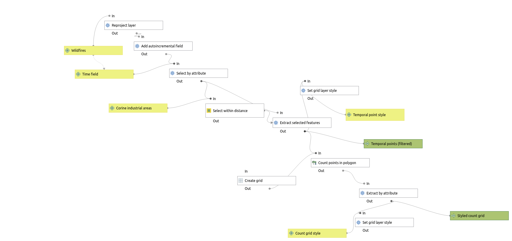
As always, there are several style files and a QGIS processing model file that runs the whole processing chain.
You can download all the files from this link or download them individually in the folder QGIS-files.
Data exploration and filtering#
In this tutorial we will work with wild fire data from NASA FIRMS. The data has been filtered to mainland Finland.
Let’s have a quick look at our data. The data is in csv-format, which means importing it to QGIS will require a bit of manual input.
Instructions:
Open drop-down Layer > Data source manager.
Navigate to Delimited text.
Select fire_data_for_map.csv as the input file.
QGIS should autofill the fields. If not:
Select Point coordinates
X field: LONGITUDE
Y field: LATITUDE
CRS: EPSG:4326 - WGS84
Press Add.
Let’s reproject the layer to a more sensible CRS for Finland and then add a unique identifier for each row – something our data currently lacks!
Instructions:
Run Reproject and reproject the data to EPSG:3067.
Run Add autoincremental field on reprojected.
Temporal controller#
Start exploring the dataset. As usual, take a look at the attribute table and spatial distibution of values. Add a background map as needed.
This time, our dataset includes a temporal field. We will use the temporal controller in QGIS to filter, visualize and animate temporal geodata.
Instructions:
Open properties for the latest layer, such as incremented
Select the tab Temporal
Activate dynamic temporal control
Configuration: Single field with date/time
Field: ACQ_DATE
Event duration: 1 AND Month
Notice that there’s now a clock symbol next to the layer in the layer list.
Next, explore the dataset temporally.
Instructions:
Activate the temporal controller panel from: View > Panels > Temporal controller
In the temporal controller panel:
From the top icons, select the third one from the left (Animated temporal navigation)
Set Animation range with Set to full range (blue arrows)
Animation step to 1 and Week
Play the animation
See how those observations flicker on and off the map in time with when they happened?
There are a few oddities, though. Notice how there seems to be almost a constant stream of observations on the West Coast of Finland, near Oulu? As it turns out, that’s where Raahe steelworks is located. So, our data captures not only natural but also industrial heat signatures.
Filtering#
Let’s filter them out using the polygon layer corine_industrial_areas – this includes all 839 Corine land cover polygons with land use type 121 (Industrial or commercial units).
Instructions:
Run the processing tool Select within distance.
Parameters:
Select features from the point layer using the polygon layer
Features are within 1000 meters
Why this tool? Some observations fall just outside the polygons; this lets us capture them.
Then invert the selection. You will find the invert selection button
on the attribute table.
Then run the processing tool Extract selected features.
With this trick, our observation count drops from 11,884 to 2426, but these should be a more accurate reflection of wild fires in Finland.
DataPlotly: Interactive plots in QGIS#
The simplest way to get a spatial overview of a dataset is to map it – for other explorations, other types of plots are more suitable. Natively, QGIS is not great at non-spatial plotting, but the great DataPlotly plugin adds a host of standard plot types (bar, circle, histogram) that can be interactively explored within QGIS and added to output maps.
Let’s examine the filtered dataset in more detail by plotting it. If you want a visual guide at any point, refer to the video tutorial or this official guide.
Instructions:
Launch a DataPlotly panel from its icon in the toolbar
Select Bar plot as the plot type
Parameters:
Layer: Selected features (or whichever is the latest layer in your processing chain)
X field:
month("ACQ_DATE")
month: Extracts the month part from a date, or the number of months from an interval
Y field:
count("AUTO", month("ACQ_DATE"))
We count the number of data points grouped by month
From the additional plot customizations
tab:
Bar mode: Overlay
Feel free to change axis labels, text sizes, etc.
Press Create plot
NB! If you make changes after creating a plot, remember to Update plot
NB2! You can draw multiple plots on the same canvas. If it starts looking weird, press Clean plot canvas
With that, you should see a plot a bit like this one:
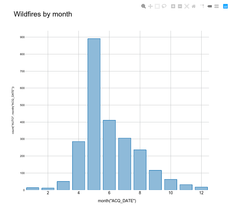
Although the picture above is a static one, you can export interactive HTML plots, too.
As to whether that distribution is accurate is another thing. There is a lot of yearly variance in the monthly distibution of wild fires, but at least in 2024, May was the peak month in Finland.
Wild fire hexbin map#
Now that we have looked at the temporal distribution of the data, let’s look at the spatial one.
Starting off with a simple, non-temporal binned hexagon map – we’ve done these in the previous tutorials:
Instructions:
Run the processing tool Create grid
Parameters:
Grid type: Hexagon
Grid extent: Calculate from layer > Selected features
Horizontal & vertical spacing: 25 kilometers
Run the processing tool Count points in polygon with Selected features and Grid
Run the processing tool Extract by attribute
Parameters:
Selection attribute: NUMPOINTS
Operator: >
Value: 0
In essence, we are removing cells with no wildfire observations
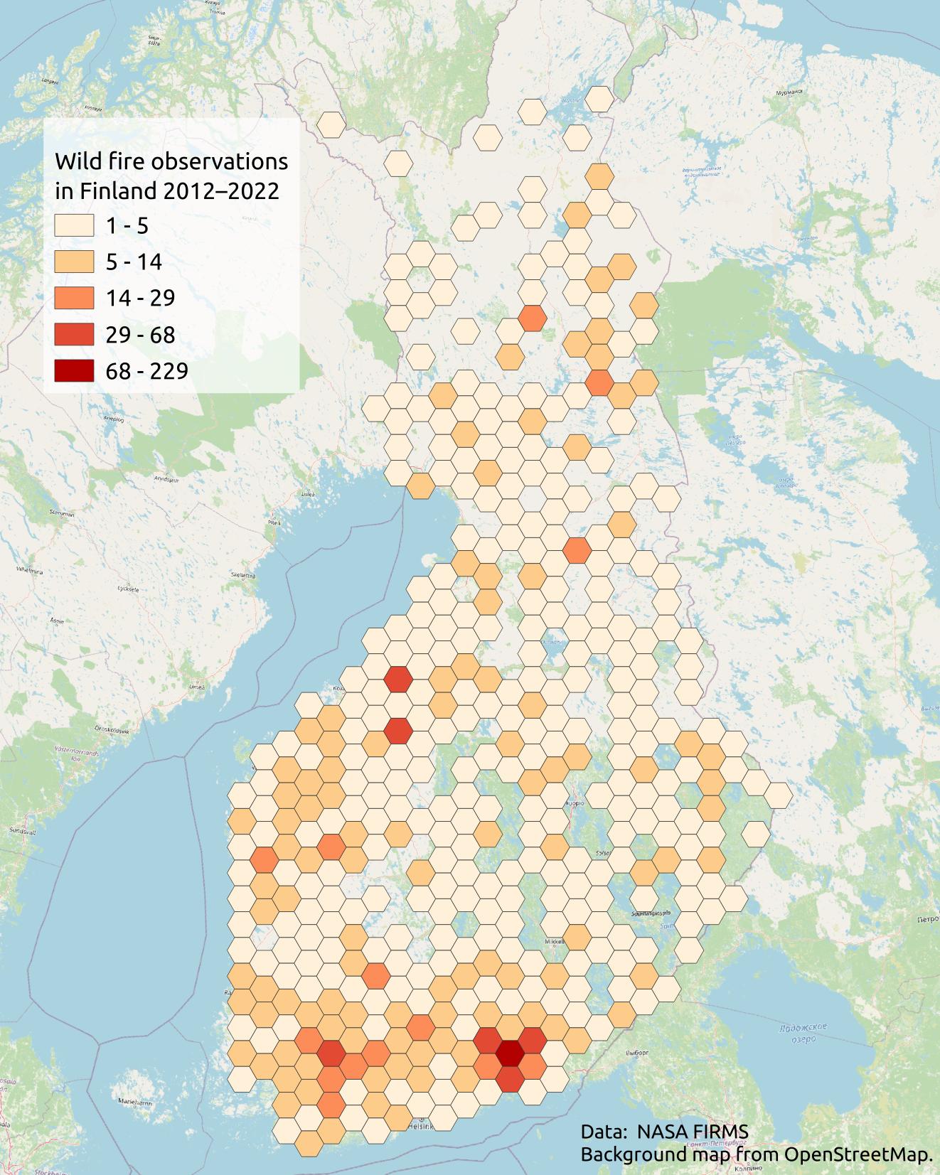
Next, style the grid layer with a graduated style. Then start layouting it.
You may end up with something similar to this:
Note:
The hexbin layer uses the style:
wild_fire_hexbin_style.qml
The DataPlotly plugin allows us to add plots as layout items – notice the DataPlotly icon  in the layout toolbar.
Instructions:
Add a plot item
Start modifying it by clicking on the item and pressing Setup selected plot
Unfortunately, we will have to replicate what we did above: Create the bar plot of wildfires aggregated by month per the instructions above
Optionally, create another plot
The map above includes another box plot that uses the ‘latitude’ field to show the distribution of wildfire observations
X field:
round("LATITUDE", 0)
Latitude values rounded up to the nearest integer
Y field:
count("AUTO", round("LATITUDE", 0))
Style Info: wild_fire_hexbin_style.qml
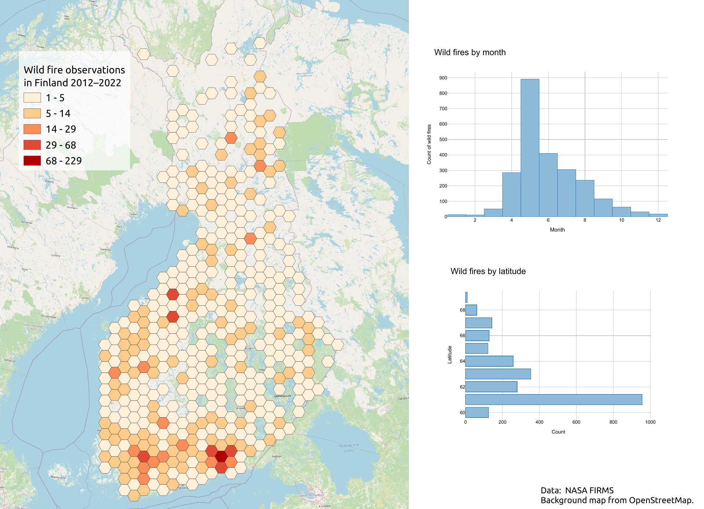
By combining maps and plots, we can communicate more information about our topic. With a different dataset, we could expand to other plot types, such as scatter plots, and show relations between our values. Of course, it’s wise not to overload the reader with information. Do keep visual hierarchy and other cartographic principles in mind if adding plots to your maps.
Making an animated map#
The additional elements in our map are cool, but the output map is still static. With the temporal controller we enabled previously, we can actually export temporal snapshots as frames for an animated map.
Work with the latest, filtered version of the data (run the processing model to get the filtered data, if needed).
Tip:Set the layer as temporal.The easiest way is to copy all style categories from fire_data_for_map,since we set up the temporal features for that layer previously.
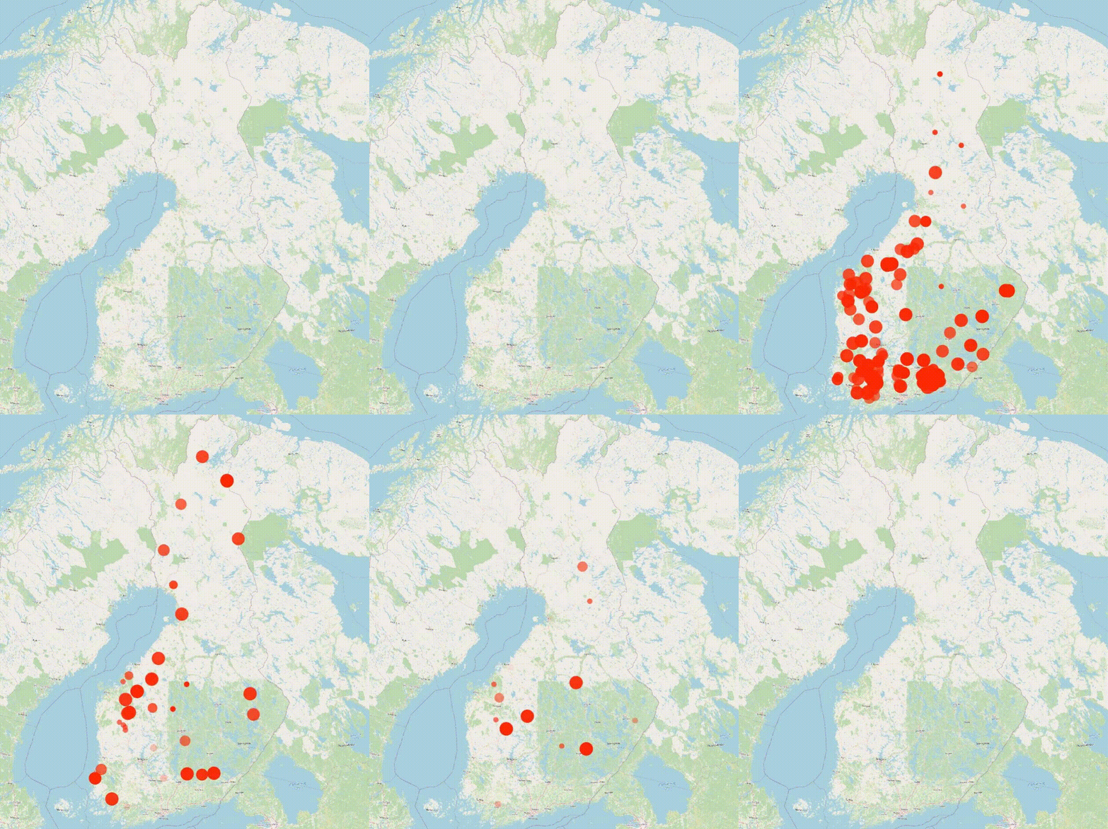
You should see wild fires popping up as points on the map. They’re fine, but we can do more to make the map visually interesting. Let’s start styling.
Instructions:
Start editing the temporal layer style
Activate data-defined override > Assistant for symbol Size
This opens a new tab where you can define override values visually
Parameters:
Source:
day(to_date(@map_start_time) - "ACQ_DATE")
This returns the number of days between the current map time (
@map_start_time) and each event dateValues: (input = date difference)
From: 1
To: 30
Output size: (symbol size in millimeters)
From: 1
To: 6
Now you should see the symbol slowly get larger before disappearing.
Tip:
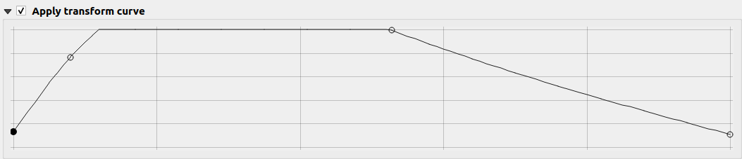
You may fine-tune the size over time even further by activating Apply transform curve
Think of X-axis as time and Y-axis as size. For example, this curve makes the points appear at full size quickly, linger for a while, and then start to disappear.
We can keep fine-tuning the style:
Tip:
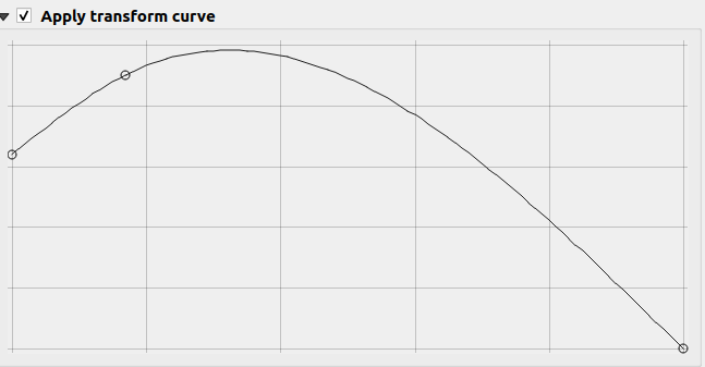
Apply the same data-defined overrides to Opacity
This is how an example transform curve for opacity looks like:
Then just to style the symbols. Red makes a lot of sense for fire, right?
You ought to see something like this on the map window:
Style Info: wild_fire_temporal_point_style.qml
Animation export#
The temporal map work a bit differently than regular map layouting and outputting: we have to export directly from the map window! That also means that we don’t have access to the regural tools (text boxes, scale bars, north arrows).
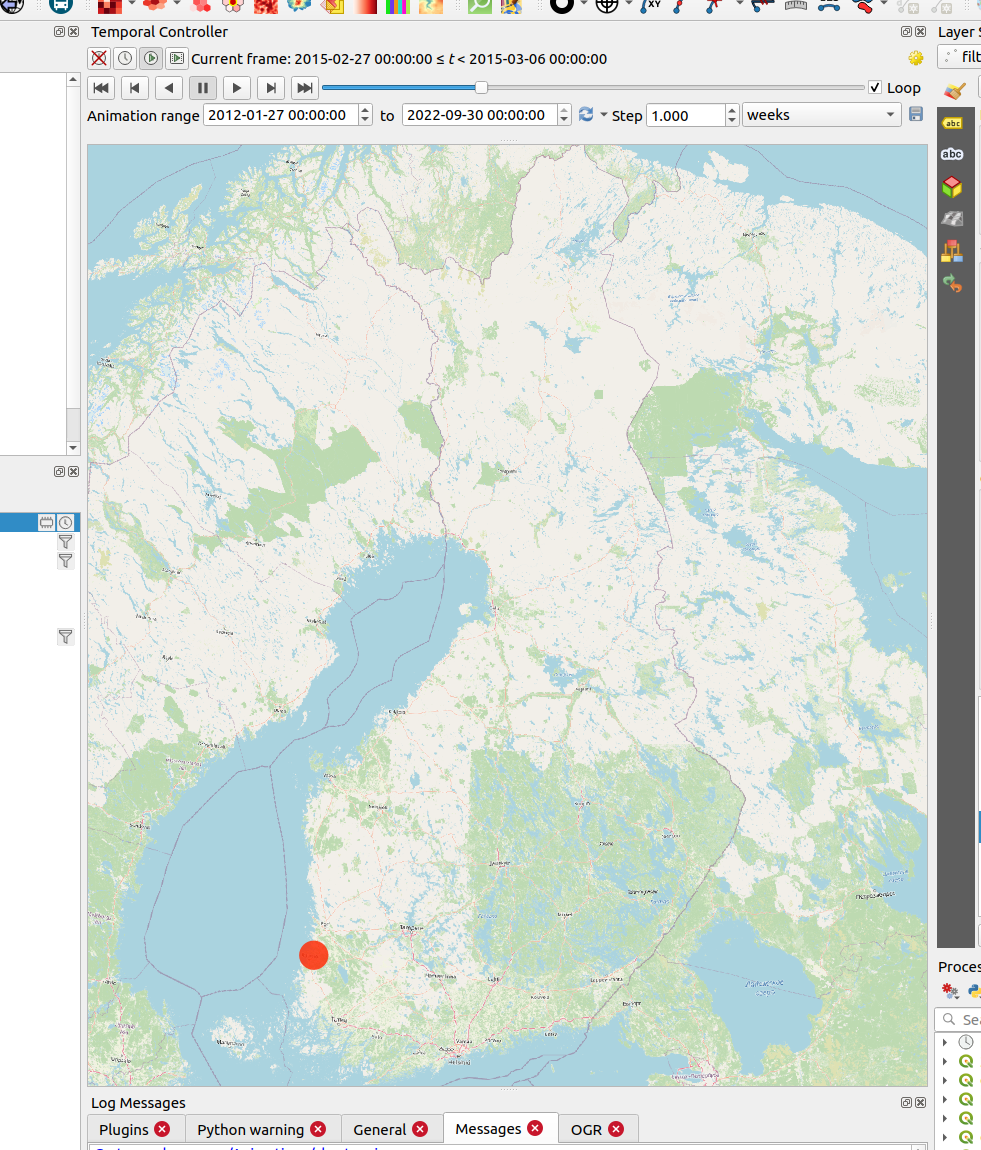
First, it’s wise to treat the map window as your layout page. Therefore, try to move the other panels and the map window scale so that the map content is well placed. For example:
Decorations#
Luckily, we can add something called decorations on the map window itself and export them with the animation frames. They’re not as flexible as the layouting tools, but will do the job.
Let’s add a “title”.
Instructions:
Click View > Decorations > Title label
Enable the title and write something in the text box, e.g.
Wild fires in Finland 2012–2022
This adds a rather ugly block on top of the map window. Let’s fix that and move the text to a better location.
Instructions:
Increase font size
Make the bar color transparent
Placement: Top right
Margin from edge:
Horizontal: 25
Vertical: 25
Timestamp#
Our animation is rather hard to interpret without knowing which date it is currently showing. Thankfully, we can code in a dynamic timestamp that gets inserted in the output frames.
Instructions:
Edit the title label text with Insert or edit an Expression
Paste:
concat('Wild fires in\n', format_date(@map_start_time, 'MM/yyyy'))
concat: Combines multiple strings into one
format_date: Transforms the input date into another format. Here, we tell it to output months as two-digit numbers and years
@map_start_time: A variable holding the Temporal Controller’s current date
Styling#
Style the rest of the map to your liking. In the example map:
The OSM background map is too noisy to my liking for this map. Replaced with a generic outline of the country:
Added a world map by typing ‘world’ to the coordinate field.
Duplicated it.
Filtered one of them with
"NAME" IN ('Russia','Sweden','Norway', 'Estonia')Another one with
"NAME" = 'Finland'Colored both with grey.
A copyright label decoration was added with data credits.
Export an animation#
Then it’s finally time to export the animation frames!
Instructions:
In the temporal controller, press Export animation (the ‘save’ icon)
Parameters:
Template:
wildfire_map_####.jpg
Change the file type to jpg to save space
The hash signs will be replaced with incremental numbers (0000, 0001…), ensuring the files are ordered
Output directory: Use an empty folder
Map settings:
Extent: Map canvas extent, or another of your choice
Draw active decorations: Enable
Temporal settings:
Range: Full range, or a shorter period
Step: 1 week (shorter = smoother animation but more frames and larger file size)
After rendering the frames as a video, here’s how our animation ended up.
It’s being rendered as a .gif to ensure it’s visible in the notebook – for better quality, a video file format like .mp4 is preferable!
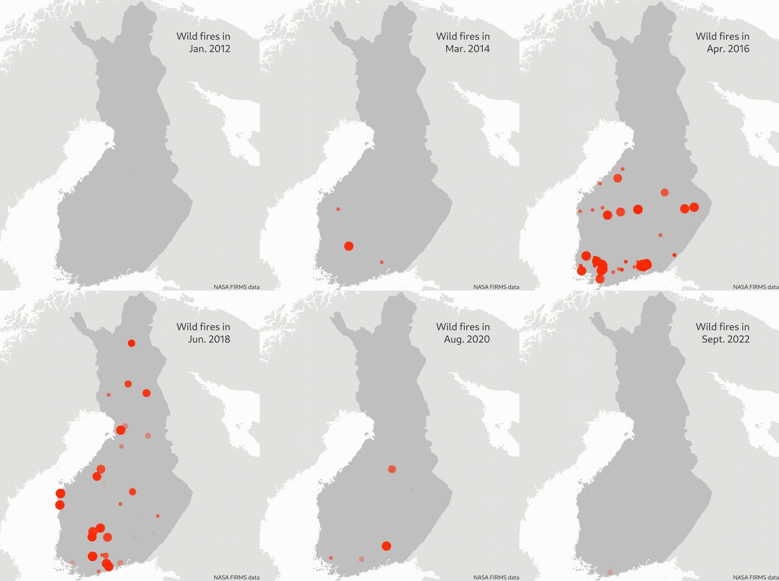
⚠️ Render animation frames as a video
Sadly, QGIS doesn’t support rendering the exported images as a video.There are multiple free and open-source tools for that purpose.Below are a few methods, listed in order of ease of use:
ffmpeg: A comprehensive command-line tool for all things video. See here for how to render an image sequence. [Complex]
Shotcut: A FOSS video editor. Instructions [Fairly straightforward]
EZGIF: An online tool that’s very easy to use, though it may lack flexibility. [Very easy]
The map you see above was rendered to mp4 in Shotcut with one picture staying for 2 frames at 25 frames per second.
Stretch goal
Notice how the map above only visualizes single observations nor does it visualize the severity of the fire (area covered, duration).
If you’d like to dig deeper, you could cluster wild fire observations close by spatially and temporally with ST-DBSCAN clustering. This returns attribute information on which cluster each point falls into, after which the points could be aggregated (Aggregate). Finally, a single coordinate point for the clusters can be extracted with Centroids. Then, visualize these centroids.
Replicating the processing flow of this notebook#
To replicate this processing flow, run the processing model wildfire-preprocessing-model.model3. NB! This model will filter and style the data. Many of the steps in this tutorial require manual input – for example, creating the DataPlotly plots and exporting animation frames.
You will need to add the example data and have the style files shared in the folder QGIS-files at the ready to run the model. Please also note that this model includes some hard-coded field-names (as do most of these models!). They are meant for replicating this notebook, and repurposing them for general use might require some modifications.