

Big data and cartography#
In this tutorial, we are going to use Python to explore and visualize some big geospatial data. We are going to work with the following datasets:
Point dataset of Flickr posts in Finland 2019–2023 acquired through the platform’s API. The posts have been stripped of all identifiable information and the exact locations obfuscated using the Laplace noise algorithm implemented in GeoPriv QGIS plugin. Only attribute information remaining are pseudo-ids and month-year timestamps. (161544 datapoints)
Origin-destination line dataset of student mobilities to Germany.
Internet speeds in the first quarter of 2023 fetched from Ookla Speedtest.
In addition to the Python libraries we have already worked with, we are going to get familiar with some additional python libraries that can be handy for handling and visulization of big geospatial data.
Flickr data from Finland#
As always, let’s start by exploring our data a little bit. Let’s load our data, make a quick plot, count the number of points, and print the head of our data first.
[1]:
import pandas as pd
import matplotlib.pyplot as plt
import geopandas as gpd
# Load the data
file_path = 'data/flickr_finland_2019_2023_obfuscated.gpkg'
flickr_data = gpd.read_file(file_path)
flickr_data.plot(markersize=2, edgecolor='none')
print(flickr_data.head())
print(f"\nThere are {len(flickr_data)} points in our dataset\n")
ERROR 1: PROJ: proj_create_from_database: Open of /opt/conda/share/proj failed
pseudo_id month_year geometry
0 2 2020-02-01 POINT (22.45380 62.69018)
1 3 2020-02-01 POINT (22.45371 62.69033)
2 4 2020-06-01 POINT (29.76744 62.59329)
3 5 2020-06-01 POINT (21.60417 63.09216)
4 6 2020-06-01 POINT (22.85247 63.22937)
There are 161544 points in our dataset
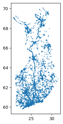
As we can see, our data is from Finland and we have 161544 points altogether representing the location of the photos. In our data, we have a column named month_year which as name suggests, containes the month and year when the photo was taken. Let’s explore the temporal distribution of our data quickly using a time series plot.
[2]:
# Convert 'month_year' to datetime format for better handling
flickr_data['month_year'] = pd.to_datetime(flickr_data['month_year'])
# Group by 'month_year' and count occurrences
time_series = flickr_data.groupby('month_year').size()
# Plotting the time series
plt.figure(figsize=(12, 6))
plt.plot(time_series, marker='o', linestyle='-', color='b')
plt.title('Number of Photos per Month (2019-2023)')
plt.xlabel('Month and Year')
plt.ylabel('Number of Photos')
plt.grid(True)
plt.xticks(rotation=45)
plt.tight_layout() # Adjusts plot to ensure everything fits without overlap
plt.show()

Hexbin map#
Hexagons are increasingly favored in the visualization of large geospatial datasets for several reasons:
Efficient Coverage and Less Wastage: Hexagons cover a surface area more efficiently than squares or triangles. When visualizing large areas, hexagonal tiling reduces gaps and overlaps, ensuring more uniform data representation.
Uniformity of Data Representation: Each hexagon has six sides of equal length, which results in a more uniform distance between the center of each hexagon and any point on its boundary. This uniformity ensures that each data point within a hexagon is equally representative of its center. In contrast, square grids have varying distances from the center to the middle of the edges versus the corners, potentially introducing bias in how data is represented spatially.
Better Nearest Neighbor Analysis: Hexagons have a unique advantage due to their six equidistant neighbors, which is beneficial for nearest neighbor analysis. This property ensures that each cell interacts more symmetrically with its surroundings, providing a more natural flow of data and smoother transitions across the grid. Squares, on the other hand, connect to their neighbors at four sides and interact less directly with their diagonal neighbors, which can complicate analyses involving spatial relationships.
Visual Appeal and Reduced Visual Errors: Hexagonal grids tend to be more visually appealing and easier for the human eye to follow. This can enhance the overall readability and interpretation of maps. Furthermore, the equidistant properties of hexagons can reduce visual distortions that often occur with square grids, where the clustering of data points might appear more intense at the corners compared to the center.
Efficient Computation: Despite a seemingly complex shape, algorithms for processing hexagonal grids are often more straightforward and computationally efficient for spatial data analyses than those for squares. This is due to the consistent distances and connectivity, which simplify the computation of spatial relationships and aggregations.
[3]:
#!pip install h3
import h3
print(h3.__version__)
4.2.2
[4]:
import h3
from shapely.geometry import Polygon
import matplotlib.pyplot as plt
import mapclassify
from shapely import Polygon
# for zoomin to Helsinki area, if needed
helsinki_bounds = {
"min_lon": 24.50,
"max_lon": 25.50,
"min_lat": 60.00,
"max_lat": 60.50
}
# Function to assign hexagon using H3
def assign_hexagon(row, resolution=8):
return h3.latlng_to_cell(row.geometry.y, row.geometry.x, resolution)
# Apply function to data
flickr_data['hex_id'] = flickr_data.apply(assign_hexagon, axis=1)
# Aggregate data within each hexagon
hex_counts = flickr_data['hex_id'].value_counts().reset_index()
hex_counts.columns = ['hex_id', 'count']
# Generate hexagon geometries
hex_counts['geometry'] = hex_counts['hex_id'].apply(
lambda x: Polygon([(lon, lat) for lat, lon in h3.cell_to_boundary(x)])
)
hex_gdf = gpd.GeoDataFrame(hex_counts, geometry='geometry')
fig, ax = plt.subplots(1, 1, figsize=(10, 10))
# Set the bounds for the plot to zoom into Helsinki. if desired
#ax.set_xlim(helsinki_bounds["min_lon"], helsinki_bounds["max_lon"])
#ax.set_ylim(helsinki_bounds["min_lat"], helsinki_bounds["max_lat"])
hex_gdf.plot(ax=ax, column="count",scheme="Natural_Breaks", k=5, cmap="RdYlBu", legend=True, legend_kwds={'loc': 'lower right'})
[4]:
<Axes: >

Here is a breakdown of what we are doing in the block of code above:
Define a Function to Assign Hexagons:
def assign_hexagon(row, resolution=8):
return h3.geo_to_h3(row.geometry.y, row.geometry.x, resolution)
Purpose: This function converts geographic coordinates into H3 indices. Each H3 index represents a hexagonal cell on the globe at a specified resolution.
Parameters:
row: A row of a DataFrame, expected to havegeometryattributes (yfor latitude andxfor longitude).resolution: The granularity of the hexagonal grid. Higher values create smaller hexagons.
Functionality: The function
h3.geo_to_h3()takes latitude (row.geometry.y), longitude (row.geometry.x), andresolutionto generate a unique H3 index (hexagon ID) for that location.
Apply Function to Data:
flickr_data['hex_id'] = flickr_data.apply(assign_hexagon, axis=1)
Purpose: To assign an H3 hexagon ID to each record in the
flickr_dataGeoDataFrame.Method:
DataFrame.apply()applies theassign_hexagonfunction along the DataFrame’s rows (axis=1).
Aggregate Data Within Each Hexagon:
hex_counts = flickr_data['hex_id'].value_counts().reset_index()
hex_counts.columns = ['hex_id', 'count']
Purpose: To count occurrences of each unique H3 index in
flickr_data.Functionality:
value_counts(): This function counts how many times each unique value appears in thehex_idcolumn.reset_index(): Converts the Series returned byvalue_counts()into a DataFrame.Renaming Columns: Columns are named to
hex_idandcountfor clarity.
Generate Hexagon Geometries:
hex_counts['geometry'] = hex_counts['hex_id'].apply(lambda x: h3.h3_to_geo_boundary(x, geo_json=True))
Purpose: To convert each H3 index back into a polygon that represents the hexagonal cell on a map.
Method: The
h3.h3_to_geo_boundary()function retrieves the vertices of the hexagon associated with each H3 index, formatted for use in GeoJSON.
Convert Hexagon Geometries to GeoDataFrame:
def hex_to_polygon(hex):
return Polygon([(lon, lat) for lon, lat in hex])
hex_counts['geometry'] = hex_counts['geometry'].apply(hex_to_polygon)
hex_gdf = gpd.GeoDataFrame(hex_counts, geometry='geometry')
Purpose: To transform the list of hexagon vertices into
shapely.Polygonobjects suitable for spatial operations and visualization.Functionality:
hex_to_polygon: A function that converts a list of (longitude, latitude) tuples into aPolygon.Applying the conversion function to each hexagon’s vertices.
Creating a
GeoDataFrame
We will learn how to make interactive plots later in this course. But let’s have a quick exploration of our data using plotly:
[5]:
import plotly.express as px
import mapclassify as mc
classifier = mc.NaturalBreaks(hex_gdf['count'], k=10)
hex_gdf['count_class'] = classifier.yb # Assign class labels to the hex_gdf
# Plot with Plotly
fig = px.choropleth_mapbox(data_frame=hex_gdf, geojson=hex_gdf.__geo_interface__,
locations="hex_id", color='count_class',
color_continuous_scale="Viridis",
featureidkey="properties.hex_id",
mapbox_style="carto-positron",
zoom=5, center={"lat": 64.5, "lon": 26.0},
opacity=0.5, labels={'count':'Data Points'},
hover_data={'count': True}
)
fig.update_layout(margin={"r":0,"t":0,"l":0,"b":0})
fig.show()
[6]:
import plotly.io as pio
pio.write_html(fig, file='html/map.html')
Student mobility to Germany#
We’ll work with data that describes student mobilities in the European Union’s Erasmus exhange program at the level of the statistical NUTS2 regions. The full dataset has been processed by Tuomas Väisänen and Oula Inkeröinen as part of Mobi-Twin project at the Digital Geography Lab, University of Helsinki.
[7]:
import geopandas as gpd
import matplotlib.pyplot as plt
from shapely.geometry import LineString, Point
# Load the geopackage file for student mobility
mobility_file_path = 'data/2018_student_mobility_NUTS2_germany.gpkg'
student_mobility_data = gpd.read_file(mobility_file_path)
# Assume each code's first two letters are the country code
student_mobility_data['origin_country'] = student_mobility_data['ORIGIN'].str[:2]
student_mobility_data['destination_country'] = student_mobility_data['DESTINATION'].str[:2]
# Filtering only mobilities that end in Germany ('DE')
student_mobility_data_filtered = student_mobility_data[student_mobility_data['destination_country'] == 'DE']
# Aggregating by origin and destination country to count the number of mobilities
country_mobility_counts = student_mobility_data_filtered.groupby(['origin_country', 'destination_country']).size().reset_index(name='counts')
# Merging this data back to get a single representative geometry for each pair
aggregated_data = student_mobility_data_filtered.drop_duplicates(subset=['origin_country', 'destination_country'])
aggregated_data = aggregated_data.merge(country_mobility_counts, on=['origin_country', 'destination_country'])
# Load Europe boundaries shapefile
europe_boundaries_path = 'data/europe_borders.zip'
europe_boundaries = gpd.read_file(europe_boundaries_path)
# Ensure both datasets use the same CRS
aggregated_data = aggregated_data.to_crs(europe_boundaries.crs)
[8]:
europe_boundaries['centroid'] = europe_boundaries.geometry.centroid
# Function to find the centroid of the country containing the point
def find_country_centroid(point, country_gdf):
for idx, country in country_gdf.iterrows():
if country.geometry.contains(point):
return country.centroid
return None
# Relocate each endpoint of the lines
def relocate_line(line, country_gdf):
start_point = line.coords[0]
end_point = line.coords[-1]
start_centroid = find_country_centroid(Point(start_point), country_gdf)
end_centroid = find_country_centroid(Point(end_point), country_gdf)
if start_centroid is not None and end_centroid is not None:
return LineString([start_centroid, end_centroid])
return line # Return the original line if no containing country found
# Apply the relocation to all lines
aggregated_data['geometry'] = aggregated_data['geometry'].apply(relocate_line, country_gdf=europe_boundaries)
aggregated_data.head()
/tmp/ipykernel_605/3538818964.py:1: UserWarning:
Geometry is in a geographic CRS. Results from 'centroid' are likely incorrect. Use 'GeoSeries.to_crs()' to re-project geometries to a projected CRS before this operation.
[8]:
| OD_ID | ORIGIN | DESTINATION | geometry | origin_country | destination_country | counts | |
|---|---|---|---|---|---|---|---|
| 0 | AL01_DE94 | AL01 | DE94 | LINESTRING (20.06279 41.14066, 10.39424 51.10990) | AL | DE | 5 |
| 1 | AT13_DE11 | AT13 | DE11 | LINESTRING (16.37753 48.20853, 9.62527 49.01532) | AT | DE | 34 |
| 2 | BE10_DE30 | BE10 | DE30 | LINESTRING (4.66217 50.64094, 10.39424 51.10990) | BE | DE | 13 |
| 3 | BG32_DEA4 | BG32 | DEA4 | LINESTRING (25.22465 42.75592, 10.39424 51.10990) | BG | DE | 6 |
| 4 | CZ01_DE11 | CZ01 | DE11 | LINESTRING (15.33019 49.74056, 10.39424 51.10990) | CZ | DE | 67 |
[9]:
import matplotlib.lines as mlines
import matplotlib
europe_boundaries = europe_boundaries.to_crs(epsg=3034)
aggregated_data = aggregated_data.to_crs(epsg=3034)
# Optional: Normalize counts for color mapping
aggregated_data['normalized_counts'] = aggregated_data['counts'] / aggregated_data['counts'].max()
# Choose a colorblind-friendly colormap (e.g., 'viridis', 'cividis', 'plasma', or custom blue-orange)
cmap = matplotlib.colormaps.get_cmap('copper')
fig, ax = plt.subplots(1, 1, figsize=(12, 10))
europe_boundaries.boundary.plot(ax=ax, edgecolor='gray', linewidth=0.3, alpha=0.4)
# Plot mobility lines with color mapping based on counts
for _, row in aggregated_data.iterrows():
linewidth = row['normalized_counts'] * 5 # Scale line width
color = cmap(row['normalized_counts']) # Get color from colormap
line = gpd.GeoSeries(row['geometry'])
line.plot(ax=ax, linewidth=linewidth, color=color, alpha=0.8)
# Add a legend
# Create custom lines for the legend
legend_lines = [
mlines.Line2D([], [], color=cmap(0.1), linewidth=1, label='Low'),
mlines.Line2D([], [], color=cmap(0.5), linewidth=2.5, label='Medium'),
mlines.Line2D([], [], color=cmap(0.9), linewidth=5, label='High')
]
ax.legend(handles=legend_lines, title='Mobility Volume')
ax.set_title('Aggregated Student Mobility to Germany by Country')
ax.set_axis_off()
plt.show()
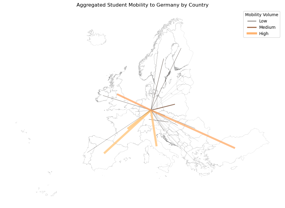
📢 Note
For enhanced visualization of complex flows, like what we just created, consider exploring other specialized tools such as the Edge-bundling tool for regional mobility flow data.
Developed by the Digital Geography Lab at the University of Helsinki, this Python-based tool uses edge-path bundling techniques to significantly reduce visual clutter in flow maps.
It processes input CSV files containing centroid coordinates and flow data, outputting bundled geometries in GeoPackage format. This tool is part of the Mobi-Twin research project, which focuses on the twin transition and changing patterns of spatial mobility in Europe.
Mapping Speedtest data with lonboard#
The dataset we are going to use now is from Ookla, known for its Speedtest application, which provides data on internet connection speeds across different regions and network types. This specific dataset that we will use here, contains mobile internet performance for the first quarter of 2023. It is stored in the Parquet format, which is highly efficient for handling large datasets as it supports advanced data compression and encoding schemes, making it suitable for big data applications.
While vsiualizing our data, we will explore the use of the `ionboard library <https://developmentseed.org/lonboard/latest/>`__. This is a new powerful library, designed for efficient handling and analysis of geospatial data. This library is particularly optimized for performance and scalability, which makes it a good choice for processing big geospatial data.
Let’s start by importing the libraries we need and fetch our data.
[10]:
from pathlib import Path
import geopandas as gpd
import numpy as np
import pandas as pd
import shapely
from palettable.colorbrewer.diverging import BrBG_10
from lonboard import Map, ScatterplotLayer
from lonboard.colormap import apply_continuous_cmap
[11]:
# Fetching data
url = "https://ookla-open-data.s3.us-west-2.amazonaws.com/parquet/performance/type=mobile/year=2023/quarter=1/2023-01-01_performance_mobile_tiles.parquet"
# a local copy of data is stored here
local_path = Path("data/internet-speeds.parquet")
if local_path.exists():
net_speed = gpd.read_parquet(local_path)
else:
columns = ["avg_d_kbps", "tile"]
df = pd.read_parquet(url, columns=columns)
tile_geometries = shapely.from_wkt(df["tile"])
tile_centroids = shapely.centroid(tile_geometries)
net_speed = gpd.GeoDataFrame(df[["avg_d_kbps"]], geometry=tile_centroids, crs='EPSG:4326')
net_speed.to_parquet(local_path)
net_speed.head()
print(f"There are {len(net_speed)} records in our dataset")
There are 3728229 records in our dataset
[12]:
# Creat a map instance
layer = ScatterplotLayer.from_geopandas(net_speed)
m = Map(layer)
m
[12]:
[13]:
layer.get_fill_color = [0, 0, 200, 200]
[14]:
# Define the minimum and maximum boundary for normalization
min_bound = 5000
max_bound = 50000
# Extract the average download speeds from the GeoDataFrame column 'avg_d_kbps'
download_speed = net_speed['avg_d_kbps']
# Normalize the download speeds to a range between 0 and 1 based on defined min and max bounds
normalized_download_speed = (download_speed - min_bound) / (max_bound - min_bound)
# Access the BrBG_10 colormap from Matplotlib
BrBG_10.mpl_colormap
# Set the fill color of the layer using the normalized download speed and the BrBG_10 colormap with an opacity of 70%
layer.get_fill_color = apply_continuous_cmap(normalized_download_speed, BrBG_10, alpha=0.7)
[15]:
# Set the radius of each point in the layer based on the normalized download speed, scaled by 200
layer.get_radius = normalized_download_speed * 200
# Specify that the radius values are in meters
layer.radius_units = "meters"
# Set the minimum radius size to 0.5 pixels to ensure visibility at high zoom levels
layer.radius_min_pixels = 0.5
View the interactive map here, if now shown properly on the website.
[16]:
# For display on website
from IPython.display import IFrame
output = IFrame(src='https://carto-gis.github.io/html-host/Ookla_map_cartoGIS.html', width=1000, height=400)
display(output)
[ ]: